
Here is the brutal reality of modern web development: Over 60% of your website traffic is coming from a mobile device, yet 90% of developers design and animate for a 27-inch desktop monitor.
You spend hours crafting the perfect 3D scrollytelling experience. It runs flawlessly on your M-series Mac. But the moment your client opens it on an iPhone on a 4G connection, the site stutters, the scrollbar jitters, and the layout breaks.
Achieving the perfect balance between visual fidelity and raw performance is the hallmark of a top-tier frontend architect. If you want your websites to win awards and convert users, you must master GSAP mobile optimization.
In this comprehensive guide, I will show you exactly how to optimize GSAP animations for mobile devices. We will dive into the browser rendering pipeline, solve the infamous iOS address bar resize bug, and learn how to write responsive JavaScript that degrades gracefully without sacrificing the premium feel of your brand.
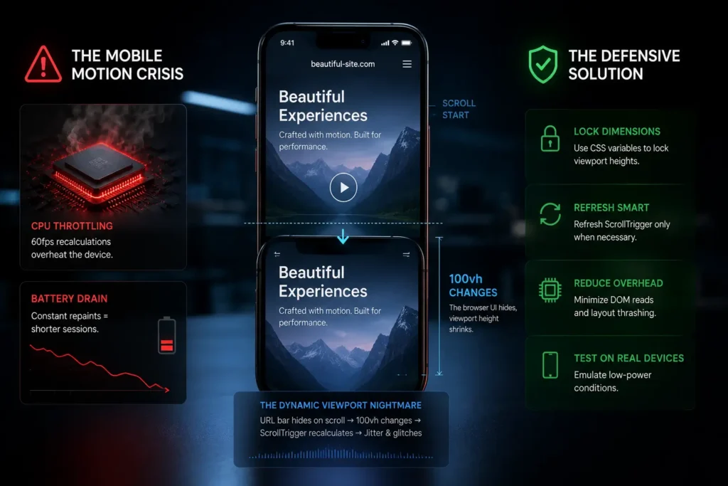
The Mobile Motion Crisis: Why Beautiful Sites Fail on Phones
Mobile devices are engineering marvels, but they have strict thermal and battery limitations. When you force a mobile CPU to recalculate the geometry of a webpage 60 times a second, it throttles.
Furthermore, mobile browsers introduce a unique nightmare: The Dynamic Viewport. As a user scrolls down on Safari or Chrome, the browser’s URL address bar hides to give the user more screen real estate. This fundamentally changes the 100vh (viewport height) measurement. If your GSAP ScrollTrigger relies on viewport height calculations, the timeline will constantly recalculate on every pixel scrolled, causing severe visual jitter.
To survive the mobile environment, we must code defensively.
Rule #1: Animate the GPU, Not the CPU
The most common mistake I see from junior developers is animating “Layout” properties.
When you animate properties like width, height, margin, top, or left, the browser has to recalculate the layout of every other element on the page (Layout Thrashing), repaint the pixels, and composite the layers. A mobile processor simply cannot do this at 60fps.
The Fix: You must exclusively animate Composite properties. These are handed off directly to the device’s GPU, bypassing the CPU bottleneck entirely.
-
Use
x,y,rotation,scale(Transforms) -
Use
opacity
Code Example: The Performance Difference
❌ The Amateur Way (Causes Mobile Lag):
// This forces layout recalculation on every frame
gsap.to(".hero-box", {
  top: "100px",
  left: "50px",
  width: "500px",
  duration: 1
});
✅ The Architect Way (GPU Accelerated):
// This runs silky smooth on mobile hardware
gsap.to(".hero-box", {
  y: 100, // Translates to translateY
  x: 50,  // Translates to translateX
  scaleX: 1.5, // Fakes width changes without layout shifts
  duration: 1,
  force3D: true // Forces GPU hardware acceleration
});
Rule #2: Graceful Degradation with gsap.matchMedia()
A complex horizontal scroll section that pins the screen looks incredible on a widescreen desktop. On a vertical mobile phone, it often feels claustrophobic, frustrating, and counter-intuitive.
You should not serve the same GSAP timeline to mobile users that you serve to desktop users. You need responsive JavaScript.
In the past, managing window resize events manually was a nightmare of event listeners and memory leaks. Today, we use gsap.matchMedia(). This powerful tool allows you to wrap your GSAP code in breakpoints, automatically killing and reverting animations when the screen size changes.
Code Example: Responsive GSAP Architecture
/* Hide elements intended for GSAP reveals to prevent FOUC */
.gsap-reveal {
    visibility: hidden;
}
2. Use autoAlpha in GSAP: In your JavaScript, never just animate opacity. Use GSAP’s autoAlpha. It automatically handles the visibility: hidden property, flipping it to visible the exact millisecond the animation starts.
Step 3: Structuring Your GSAP JavaScript for WordPress
Now that GSAP is loaded and our CSS defenses are up, we write the JavaScript inside the /js/custom-animations.js file we enqueued earlier.
In 2026, the standard for GSAP architecture is using gsap.context(). It makes cleanup incredibly easy, which is vital if your WordPress site uses dynamic page transitions.
The JavaScript Architecture
// 1. Create a matchMedia instance
let mm = gsap.matchMedia();

// 2. Add breakpoints
mm.add({
  // Define your media queries
  desktop: "(min-width: 800px)",
  mobile: "(max-width: 799px)"
}, (context) => {

  // Destructure the conditions
  let { desktop, mobile } = context.conditions;

  // DESKTOP: Complex Scrollytelling
  if (desktop) {
    gsap.to(".portfolio-gallery", {
      xPercent: -100,
      scrollTrigger: {
        trigger: ".gallery-wrapper",
        pin: true,
        scrub: 1
      }
    });
  }

  // MOBILE: Simplified Vertical Reveal
  if (mobile) {
    gsap.from(".portfolio-card", {
      y: 50,
      opacity: 0,
      stagger: 0.1,
      scrollTrigger: {
        trigger: ".gallery-wrapper",
        start: "top 80%"
        // Notice: No pinning, no heavy scrubbing on mobile
      }
    });
  }

  // Optional: Return a cleanup function if needed
  return () => {
    // Custom cleanup code here
  };
});
By writing conditional timelines, you preserve the UX intent while respecting the hardware limitations of the user’s device.
Rule #3: Taming the Mobile Scrollbar (Jitter & Resize Fixes)
If your pinned sections are shaking or jumping on an iPhone, you have fallen victim to the iOS address bar resize bug.
Because ScrollTrigger uses the height of the viewport to calculate its start and end points, the hiding/showing of the mobile address bar forces ScrollTrigger.refresh() to fire continuously.
The Fix: GSAP has built-in configurations to combat this.
// Place this at the very top of your JS file before creating timelines

// 1. Ignore small vertical resize events triggered by the mobile address bar
ScrollTrigger.config({ ignoreMobileResize: true });

// 2. Normalize scroll (Hijacks the scroll to prevent native browser jumps)
// Warning: Test this thoroughly as it changes the native "feel" of the scroll
ScrollTrigger.normalizeScroll(true);

// 3. Prevent overlaps on fast scrolling
ScrollTrigger.config({ limitCallbacks: true });
By telling ScrollTrigger to ignore the mobile address bar shifting, your pinned sections will remain rock solid.
Real-World Example Websites Doing Mobile GSAP Right
To understand this balance, we must study the masters.
-
Apple (Product Pages): Apple is the king of scrollytelling. However, if you view an iPhone product page on a desktop vs. a mobile device, you will notice a stark difference. On desktop, they use heavy WebGL video scrubbing. On mobile, they swap the videos for lightweight
.webpimage sequences or simplified CSS transforms. They prioritize frame rate over feature parity. -
Cuberto (Agency Portfolio): Cuberto uses aggressive cursor-tracking and magnetic buttons on desktop. On mobile, these event listeners are completely stripped out via
matchMedia, replacing them with native touch-friendly tap states. -
Locomotive (Design Studio): Known for pioneering smooth scroll, Locomotive gracefully disables complex horizontal pinning on their mobile viewports, allowing the content to stack into a natural, vertical feed that is native to thumb-scrolling.
Comparative Table: Desktop vs. Mobile Animation Strategies
When architecting your site, use this matrix to define your animation boundaries:
| Interaction Type | Desktop Strategy | Mobile Strategy | Performance & UX Impact |
| Complex Pinning | Heavy use (Horizontal scrolling, layered reveals) | 🚫 Avoid or limit heavily | Prevents mobile users from feeling “stuck” while scrolling. |
| Parallax | Deep multi-layer depth (Y and X axis) | 🟡 Subtle single-layer (Y-axis only) | Reduces GPU memory load and battery drain. |
| Micro-Interactions | Mouse-move tracking (Magnetic buttons, custom cursors) | 🚫 Disable entirely | Removes unnecessary JavaScript event listeners; touch has no “hover”. |
| Asset Loading | High-res video backgrounds | 🟢 Optimized WebP or SVG | Ensures instant LCP (Largest Contentful Paint) on 4G networks. |
FAQ: Troubleshooting GSAP on Mobile
Q1: Why is my ScrollTrigger animation firing way too early or late on mobile? A: This is almost always caused by images loading after GSAP has calculated the layout. If an image lazy-loads and pushes your content down, ScrollTrigger’s internal map of the DOM is now wrong. Fix: Always define explicit width and height attributes on your images in CSS/HTML. If you must load dynamic content, call ScrollTrigger.refresh(); after your assets are fully loaded.
Q2: Does running GSAP animations drain mobile battery life? A: Yes, any continuous JavaScript execution will consume battery. However, GSAP is highly optimized. It automatically powers down its internal requestAnimationFrame ticker when no animations are running. To be responsible, pause your looping animations (like background ambient movement) when they scroll out of view using ScrollTrigger.
Q3: How do I handle touch events alongside scroll events? A: If you are using GSAP Draggable to create touch-sliders on mobile, ensure you set type: "x" (or whichever axis you are dragging). GSAP will automatically apply touch-action: pan-y via CSS, which tells the mobile browser to allow native vertical scrolling, but hijack the horizontal swipe for the slider. This prevents the user from accidentally scrolling down the page while trying to swipe a carousel.
Conclusion & Next Steps
Understanding how to optimize GSAP animations for mobile devices is the ultimate test of a frontend developer. It requires you to shift your mindset from “What looks cool?” to “What runs flawlessly?”
By animating on the GPU, mastering gsap.matchMedia(), and coding defensively against mobile browser quirks, you can achieve the holy grail of web design: a visually stunning, immersive experience that loads instantly and runs at a locked 60fps in the palm of your user’s hand.
Stop fighting the hardware. Start engineering for it.
Your next step: Audit your current project. Open it on a physical mobile device, turn on the Chrome DevTools FPS meter, and start refactoring those layout properties into transforms. You will feel the difference immediately.
